The User Art Topic
Moderator: Forum Moderators

Re: It is gone again Art Topic
I hope it's ok if I post here...
I made this a day ago, when I was experimenting with charcoal. C&C welcome. Maybe next time I shouldn't ink it.

I made this a day ago, when I was experimenting with charcoal. C&C welcome. Maybe next time I shouldn't ink it.
"we alone truly exist, ... the shadows we traverse are but projections of our own desires..."
Orbivm ||| The Thread of Ill-Fated Portraits
Orbivm ||| The Thread of Ill-Fated Portraits

Re: It is gone again Art Topic
Nice work on the cape; that capework is not exactly "DC Comics" level quality, but you actually look like you're on the right track. Keep at it.Corvvs wrote:I hope it's ok if I post here...
I made this a day ago, when I was experimenting with charcoal. C&C welcome. Maybe next time I shouldn't ink it.
Two areas for improvement (in future drawings):
- Your shading is ... nonsensical. Shading follows actual rules (optics, basically). I've typed this out too many times, here (need to make a good tutorial on it), but suffice it to say, shading in art basically works like a simplified version of what happens in a 3d rendering program.
It's all about "what direction a surface is facing towards", compared with "what direction the light is coming from." Stuff is brightest NOT when it's facing most directly at the light - rather, it's brightest when it's halfways between the light, and the "viewer's" eyes.
- Your composition is okay, but it's a bit boring and common. Composition is all about balance and symmetry. Putting the figure right in the middle will make things balanced and symmetrical, but it's kinda boring, because everyone does that right from age 5 onwards. It's best to have something, anything in there besides just the "main figure", and use that something so that you can still balance the picture without having them smack dab in the middle.
Play Frogatto & Friends - a finished, open-source adventure game!
Re: It is gone again Art Topic
Thanks.Jetryl wrote: Nice work on the cape; that capework is not exactly "DC Comics" level quality, but you actually look like you're on the right track. Keep at it.
I tried to do that, as I have seen you type that out a bunch about people's portraits. Time to retry it.Jetryl wrote:Two areas for improvement (in future drawings):
- Your shading is ... nonsensical. Shading follows actual rules (optics, basically). I've typed this out too many times, here (need to make a good tutorial on it), but suffice it to say, shading in art basically works like a simplified version of what happens in a 3d rendering program.
Hmm. I hadn't thought of that. Thanks.Jetryl wrote: - Your composition is okay, but it's a bit boring and common. Composition is all about balance and symmetry. Putting the figure right in the middle will make things balanced and symmetrical, but it's kinda boring, because everyone does that right from age 5 onwards. It's best to have something, anything in there besides just the "main figure", and use that something so that you can still balance the picture without having them smack dab in the middle.
"we alone truly exist, ... the shadows we traverse are but projections of our own desires..."
Orbivm ||| The Thread of Ill-Fated Portraits
Orbivm ||| The Thread of Ill-Fated Portraits
-
Elvish_Pillager

- Posts: 8137
- Joined: May 28th, 2004, 10:21 am
- Location: Everywhere you think, nowhere you can possibly imagine.
- Contact:
Re: It is gone again Art Topic
It occurs to me that I haven't posted anything for some time, while my drawing skill set has changed drastically. Here's some of my more recent stuff (all from observation), in case you're interested.
It's all fun and games until someone loses a lawsuit. Oh, and by the way, sending me private messages won't work. :/ If you must contact me, there's an e-mail address listed on the website in my profile.
-
Girgistian

- Art Contributor
- Posts: 668
- Joined: April 5th, 2008, 8:23 pm
- Location: The lands of perkele
Re: It is gone again Art Topic
I'll have to say those are cool... as a yet inproficient shader, I'll also admit I couldn't have drawn anything like that with just charcoal - meaning Elvish Pillager's works. As for Corvvs' bird-fella, you've still got something to learn about drawing itself, I think the idea is nice. It's kinda amusing, a bird carrying a bird-cage.
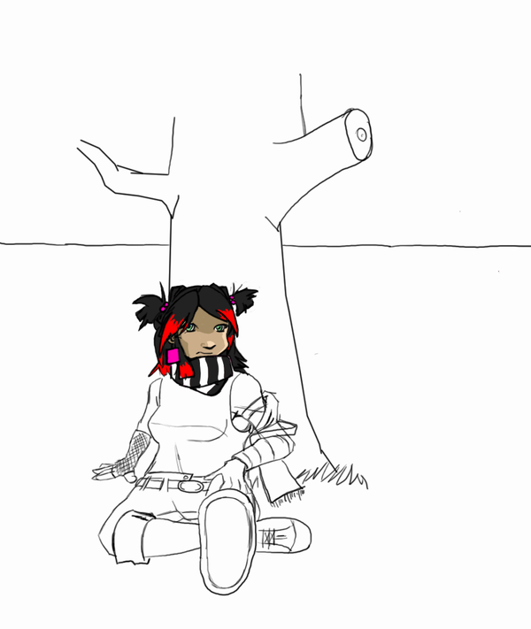
Something of my own then. Meet Mr. Revolting.
Pfft. Just noticed the jpeg form messed it up a bit. Oh well.
Something of my own then. Meet Mr. Revolting.
Pfft. Just noticed the jpeg form messed it up a bit. Oh well.
For the dark gods!
Re: It is gone again Art Topic
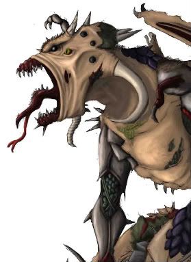
I did some more charcoal...
hope the link works. Now I ought to get back to my gryphon portrait.
link
hope the link works. Now I ought to get back to my gryphon portrait.
link
"we alone truly exist, ... the shadows we traverse are but projections of our own desires..."
Orbivm ||| The Thread of Ill-Fated Portraits
Orbivm ||| The Thread of Ill-Fated Portraits
-
Shadow
- Posts: 1264
- Joined: September 9th, 2004, 10:27 am
- Location: Following the steps of Goethe
- Contact:
Re: It is gone again Art Topic
Mh classic drawing sadly isn't my cup of tea either.Girgistian wrote:I'll have to say those are cool... as a yet inproficient shader, I'll also admit I couldn't have drawn anything like that with just charcoal - meaning Elvish Pillager's works
...
... all romantics meet the same fate someday
Cynical and drunk and boring someone in some dark cafe ...
All good dreamers pass this way some day
Hidin’ behind bottles in dark cafes
Cynical and drunk and boring someone in some dark cafe ...
All good dreamers pass this way some day
Hidin’ behind bottles in dark cafes
-
Thrawn

- Moderator Emeritus
- Posts: 2047
- Joined: June 2nd, 2005, 11:37 am
- Location: bridge of SSD Chimera
Re: It is gone again Art Topic
A WIP for a friend
...please remember that "IT'S" ALWAYS MEANS "IT IS" and "ITS" IS WHAT YOU USE TO INDICATE POSSESSION BY "IT".--scott
this goes for they're/their/there as well
this goes for they're/their/there as well
Re: It is gone again Art Topic
Wow. Quite an improvement, I have to say.Elvish Pillager wrote:It occurs to me that I haven't posted anything for some time, while my drawing skill set has changed drastically. Here's some of my more recent stuff (all from observation), in case you're interested.
If I were to make any suggestions, I would recommend practicing the use of pencils to make "continuous tone", rather than "discrete lines". Right now, it's obvious that your drawing was made with individual strokes of the pencil, whereas (given a very strict attempt at photorealism, which is educationally useful), you ideally would be unable to see any pencil strokes. Neither one is inherently "better" than the other, but if you're shooting for photorealism, one helpful path to go down is trying to get to the point where it's irrelevant/unclear which medium your work was created with (was it paint? diluted ink washes? pencil? airbrush? digital?).
This would be useful so that you can explore making texture, and exploring finely-detailed edges - which you kinda can't right now. Right now the visible linework of the pencils is so strong that it overwhelmns any texture in the individual objects, and when it's used on the edges, and loose lines that jut over the edge make the edge a lot messier.
The tool for this is just some rolled up kleenex or cotton swabs - they also sell rolled sticks of paper (shaped like a pencil/stylus) called "smudge sticks" for the very purpose. You basically would take these, and smudge the individual lines together into a continuous tone (when appropriate in the drawing, such as on a continuous surface). I recommend against using your actual fingers, because the oil and water on them will act as a binding agent with the graphite, and make smudges of it that are extremely difficult/impossible to completely erase (it turns graphite into a form of unerasable paint/ink, basically).
Play Frogatto & Friends - a finished, open-source adventure game!
-
Sgt. Groovy

- Art Contributor
- Posts: 1471
- Joined: May 22nd, 2006, 9:15 pm
- Location: Helsinki
Re: It is gone again Art Topic
A crayfish and an eel duking it out. White pastel on black paper.

Tiedäthän kuinka pelataan.
Tiedäthän, vihtahousua vastaan.
Tiedäthän, solmu kravatin, se kantaa niin synnit
kuin syntien tekijätkin.
Tiedäthän, vihtahousua vastaan.
Tiedäthän, solmu kravatin, se kantaa niin synnit
kuin syntien tekijätkin.

Re: It is gone again Art Topic
nice! the lobster looks particularly impressive while the stones in the foreground could have used some more love.
do you do this kind of work after photo ref or from head? just curious.
do you do this kind of work after photo ref or from head? just curious.
-
Sgt. Groovy
- Art Contributor
- Posts: 1471
- Joined: May 22nd, 2006, 9:15 pm
- Location: Helsinki
Re: It is gone again Art Topic
A photo. You're right about about the stones, they would have needed more work, this was a class assignment and I ran out of time.
Tiedäthän kuinka pelataan.
Tiedäthän, vihtahousua vastaan.
Tiedäthän, solmu kravatin, se kantaa niin synnit
kuin syntien tekijätkin.
Tiedäthän, vihtahousua vastaan.
Tiedäthän, solmu kravatin, se kantaa niin synnit
kuin syntien tekijätkin.
Re: It is gone again Art Topic
That's very nice, could you make a 1280X1024 desktop wallpaper varient?
19962104.
Author of 1940:European Theatre era.
Author of 1940:European Theatre era.
Re: It is gone again Art Topic
the stones aren't bad at all - i like their variety, they jsut aren't as finished as a foreground object could be. no big deal.
but what kind of art classes do you take? i thought you said you were a biology student, or do i recall wrongly?
but what kind of art classes do you take? i thought you said you were a biology student, or do i recall wrongly?
-
Sgt. Groovy
- Art Contributor
- Posts: 1471
- Joined: May 22nd, 2006, 9:15 pm
- Location: Helsinki
Re: It is gone again Art Topic
It was a drawing course at an art club, different techniques and such. Yes, I'm an biologist, and that's why drawing nature themes intersts me. There isn't much jobs for biologists around (the last one I applied had 115 applicants!) so I have thought of checking out if publishers would be interested in buying illustrations for scientific texts.
I'm sorry, but such big resolution wouldn't look so good, the penmanship with pastels is pretty coarse.That's very nice, could you make a 1280X1024 desktop wallpaper varient?
Tiedäthän kuinka pelataan.
Tiedäthän, vihtahousua vastaan.
Tiedäthän, solmu kravatin, se kantaa niin synnit
kuin syntien tekijätkin.
Tiedäthän, vihtahousua vastaan.
Tiedäthän, solmu kravatin, se kantaa niin synnit
kuin syntien tekijätkin.