A Tale Of Two Brothers - Portraits
Moderator: Forum Moderators
-
West
- Retired Lord of Music
- Posts: 1173
- Joined: October 30th, 2006, 7:24 am
- Location: In the philotic connections between ansibles.
- Contact:
Thank you. I also like this version myself. Hopefully this style is acceptable for a mainline portrait since strict cel-shading isn't really my cup of tea (and my interest in learning it is therefore not great).torangan wrote:I like the latest version more but I'm can't judge on artistic or realism based opinions. Just personal taste.

The only issue I have with it is, it looks sort of strange for the armor to have such a detailed texture and the skin to be plainly cell-shaded.
For I am Turin Turambar - Master of Doom, by doom mastered. On permanent Wesbreak. Will not respond to private messages. Sorry!
And I hate stupid people.
The World of Orbivm
And I hate stupid people.
The World of Orbivm
-
West
- Retired Lord of Music
- Posts: 1173
- Joined: October 30th, 2006, 7:24 am
- Location: In the philotic connections between ansibles.
- Contact:
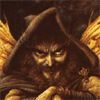
The skin is not finished yet, I will add a bit more detail to the face at least (perhaps a few little wrinkles). As for texture... a rough, dented piece of metal has a much more defined and visible texture than human skin. Adding some texture to Arnes face would probably just look weird.turin wrote:The only issue I have with it is, it looks sort of strange for the armor to have such a detailed texture and the skin to be plainly cell-shaded.
OTOH, I could always make the armor texture more subtle. But I'm aiming for neither photorealism nor a plain comic book style, so I wanted to be a little adventurous.
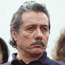
I'd generally tend to agree, but considering that Arne might actually be someone in his fourties or more, showing some more age even in the form of a texture wouldn't hurt IMO. Not that I think it's particularly necessary, and he wouldn't need to exactly look like Edward James Olmos either. On the other hand, subtle skin texturing like that would probably indeed be very hard to do without it looking weird, or so I'd imagine.West wrote:As for texture... a rough, dented piece of metal has a much more defined and visible texture than human skin. Adding some texture to Arnes face would probably just look weird.
-
Sgt. Groovy

- Art Contributor
- Posts: 1471
- Joined: May 22nd, 2006, 9:15 pm
- Location: Helsinki
The skin texture is too uniform. It should reflect the differences in skin quality in different parts of the face, and follow the surface contours also.
The patina on the armour looks nice.
The patina on the armour looks nice.
Tiedäthän kuinka pelataan.
Tiedäthän, vihtahousua vastaan.
Tiedäthän, solmu kravatin, se kantaa niin synnit
kuin syntien tekijätkin.
Tiedäthän, vihtahousua vastaan.
Tiedäthän, solmu kravatin, se kantaa niin synnit
kuin syntien tekijätkin.
-
Darth Fool
- Retired Developer
- Posts: 2633
- Joined: March 22nd, 2004, 11:22 pm
- Location: An Earl's Roadstead
To me, the hair still looks a little too flat. It needs some more thin shadows indicating how the hair sits on the head. Kind of like:

I also would probably blur the skin texture a bit more. The variation is a bit much. I would expect more variation from wrinkles and the like then the spottiness of the texture.
Overall, this is getting to look very good.
I also would probably blur the skin texture a bit more. The variation is a bit much. I would expect more variation from wrinkles and the like then the spottiness of the texture.
Overall, this is getting to look very good.
"you can already do that with WML"
Fight Creeeping Biggerism!
http://www.wesnoth.org/forum/viewtopic. ... 760#131760
http://www.wesnoth.org/forum/viewtopic. ... 1358#11358
Sweet!
Only two comments -
1) The hair could still use some work - see Darth Fool's comment.
2) The sword's hilt looks like it is made out of stone, not metal. Maybe that's intentional, but it seems sort of strange to me.
Only two comments -
1) The hair could still use some work - see Darth Fool's comment.
2) The sword's hilt looks like it is made out of stone, not metal. Maybe that's intentional, but it seems sort of strange to me.
For I am Turin Turambar - Master of Doom, by doom mastered. On permanent Wesbreak. Will not respond to private messages. Sorry!
And I hate stupid people.
The World of Orbivm
And I hate stupid people.
The World of Orbivm
-
West
- Retired Lord of Music
- Posts: 1173
- Joined: October 30th, 2006, 7:24 am
- Location: In the philotic connections between ansibles.
- Contact:
1) Personally I think the hair is fine. Using the same amount of contrast as in the example portrait will make Arne's hair look a lot darker -- and besides, my image is in a completely different style.turin wrote:Sweet!
Only two comments -
1) The hair could still use some work - see Darth Fool's comment.
2) The sword's hilt looks like it is made out of stone, not metal. Maybe that's intentional, but it seems sort of strange to me.
2) Stone huh? Hmm. I was thinking more like rough, pitted iron surface like this image. Now that you mention it though, the hilt could use a very slight green/blue hue to make it look more metallic. Right now it's just too gray.
-
Darth Fool
- Retired Developer
- Posts: 2633
- Joined: March 22nd, 2004, 11:22 pm
- Location: An Earl's Roadstead
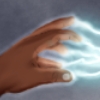
Ok, I just noticed something else. I thought his right hand looked a little flat and needs a little more shading (his left is quite good!), and then I started counting. Assuming he has a thumb that we can't see because it is behind the hilt, it looks like he has 6 fingers! Having not played this campaign, I don't know if that is part of the story, but well, I thought that I would point it out
"you can already do that with WML"
Fight Creeeping Biggerism!
http://www.wesnoth.org/forum/viewtopic. ... 760#131760
http://www.wesnoth.org/forum/viewtopic. ... 1358#11358
-
West
- Retired Lord of Music
- Posts: 1173
- Joined: October 30th, 2006, 7:24 am
- Location: In the philotic connections between ansibles.
- Contact:
Oh shite... you're right :ODarth Fool wrote:Ok, I just noticed something else. I thought his right hand looked a little flat and needs a little more shading (his left is quite good!), and then I started counting. Assuming he has a thumb that we can't see because it is behind the hilt, it looks like he has 6 fingers! Having not played this campaign, I don't know if that is part of the story, but well, I thought that I would point it out
And no, he's not supposed to have six fingers... dammit. I need to fix that.

Consult what I said to Sgt. Groovy about the knuckles "arching".
The individual fingers segments do this as well - the ones on the middle finger are longer than on the surrounding fingers.
This was a little trick I figured out recently in my "learn anatomy marathon" I've been quietly doing lately; it's had a transformative effect on my ability to draw hands.
The individual fingers segments do this as well - the ones on the middle finger are longer than on the surrounding fingers.
This was a little trick I figured out recently in my "learn anatomy marathon" I've been quietly doing lately; it's had a transformative effect on my ability to draw hands.
-
irrevenant
- Moderator Emeritus
- Posts: 3692
- Joined: August 15th, 2005, 7:57 am
- Location: I'm all around you.
The lighting on his face looks oversaturated on my monitor. ie. He looks like he's sitting right next to a really bright spotlight.
Want to post a Wesnoth idea? Great! Read these:
Frequently Posted Ideas Thread
Giving your idea the best chance of acceptance
Frequently Posted Ideas Thread
Giving your idea the best chance of acceptance