Portrait Tutorial
Moderator: Forum Moderators
Forum rules
Before posting critique in this forum, you must read the following thread:
Before posting critique in this forum, you must read the following thread:

Portrait Tutorial
i post this tutorial mainly to get feedback: is it understandable and comprehensible? is it helpful? is something unclear? do you want to know anything else?
----------------
This is a little tutorial on how i approach my portraits in the standard wesnothian style (which means inked and painterly shaded).
I'll try to cover the most important steps but if you still have questions feel free to ask.
you will need a graphic program able to handle layers and a drawing tablet. i use photoshop and don't know the gimp at all, so some advice may be photoshop specific, but most things should be possible in gimp, too.
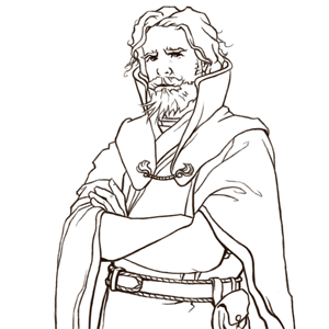
I start with a sketch first (no surprise). you can see that I already cropped it to a squarish format. To spare me time I don't do preliminary pencil sketches at all and work entirely digital. I use different colours to differentiate certain areas as a visual aid to differentiate the layers of cloth etc.. Worksize is about three times the final one.

Next step is inking. I set the layer with the sketch to a low opacity, create a new one on top of it and use a small brush to ink it, with the brush's size set to match the pen pressure. (I tend to use a dark brown, because black lines will disappear on the black background later on.)
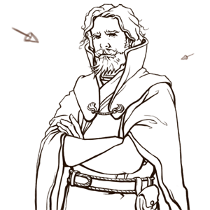
For the third step I make an important decision: the lightsource(s). I want this portrait to have two: the main lightsource top left in front of him and a secondary one behind him to the right. Multiple lightsources (typically 2 or 3) are generally a better choice than a single lightsource, because in most situations in the real world, a figure would be illuminated by multiple lightsources, even with artificial lighting at nighttime. Our minds are hard-coded to percieve this as one major cue about the 3D shape of a figure, thus it gives any drawn object much more of a feeling of 'depth' if it's lit by multiple lightsources.
According to these lightsources I start to thicken and thin down the lines - thin where the light hits and thick where an object casts a shadow.
Now I start to lay down the base colours (finally!). I use a separate layer for every colour. I create all of them below the linework layer and find it extremely useful to give them speaking names (like skin, hair, robe etc) - this Delfador had about 15 layers in the end which can get quite confusing. And below all those layers I add a bucket filled black layer for the background. (Those steps are fairly easy and can be outsourced pretty well - my boyfriend often does the flat colours for me...)
If you're doing a series of portraits for a specific race or faction in wesnoth it is very important to colourpick the basecolours to get a uniform look.

If you have done this your picture should look pretty strange, because of the outlines having all one colour. Now I activate the little "fix transparencies" ckeckbox for the linework layer - because of that I'm able to paint only on the lines. By clicking this checkbox, it locks what is transparent on the current layer, and only allows you to paint on areas that have already been drawn. Since the only things drawn so far in this layer are the lines, they're the only parts that will get touched. This allows me to recolor the lines without changing their shape at all.
I use very dark shades of the colours of the objects they encircle.

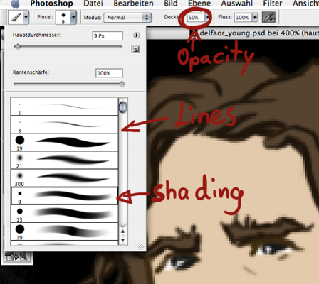
In this step the real painting starts. First we have to select a nice brush. I solely use a hard edged brush with pressure set to opacity and set the general opacity to 50%. That means if I press really hard I will maximum get a 50% opaque stroke. I have a great dislike for those fuzzy edged brushes, the pestilence of photoshop - you will always see that it is a photoshopped picture even from a distance. I like to have some visible brushstrokes in the end.
I preserve the transparency of the layer I'm working on like I did with the linework, thus I don't have to fear that I paint over the edges. I usually start with the face for it is the most important area and focal point for the portrait.
I start with two colours, one dark shade and one light and define the overall lights and darks. Don't overblend here, it's only a base.
Then I slowly start introducing more colours, two more darks and one lighter shade, that's enough.
I still use only my hard edged brush. As for blending I constantly switch between bush and colourpicker (shortcuts B and I) and sample the colour in the middle and use it to continue painting.


Now I spend a bit more time thinking about colour. It is important not only to use darker and lighter shades of the same colour (like mixing black and white in is bad if you paint with oil or arcylics) but to have some variations, like i have some purple on the skin here. In this step i add even more colour on a separate layer.
Above the skin layer i create a new one and set it to colour which makes the colours blend together nicely. If you experiment with those hues be careful you don't make him look like a clown, tone down the opacity and saturation until it looks good. Then merge it with the skin layer beneath.


In that way i continue to render all the areas and different layers. First the big areas and the little details (like in this case the girdle, gold applications and pouch) last. Don't forget to flip the canvas from time to time to detect flaws and turn it to greyscale to see if your lighting really looks good. And don't work too zoomed in, the overall impression is more important than the details (even if the details are more fun).

A further step which I didn't use on Delfador is sometimes necessary to unify the separately shaded areas. In that case I create a new layer directly under the linework and paint on it with a heavily desaturated colour and set it to "multiply". That way I have shadows spreading over the whole figure, which are not constrained to only one item of clothing, such as the robe.

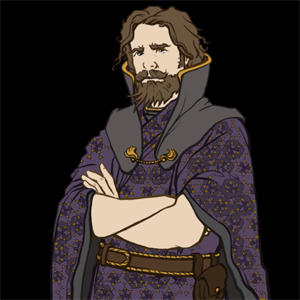
After I posted him in the forum i received some critiques and changed some things, here is the final version at my worksize:

----------------
This is a little tutorial on how i approach my portraits in the standard wesnothian style (which means inked and painterly shaded).
I'll try to cover the most important steps but if you still have questions feel free to ask.
you will need a graphic program able to handle layers and a drawing tablet. i use photoshop and don't know the gimp at all, so some advice may be photoshop specific, but most things should be possible in gimp, too.
I start with a sketch first (no surprise). you can see that I already cropped it to a squarish format. To spare me time I don't do preliminary pencil sketches at all and work entirely digital. I use different colours to differentiate certain areas as a visual aid to differentiate the layers of cloth etc.. Worksize is about three times the final one.
Next step is inking. I set the layer with the sketch to a low opacity, create a new one on top of it and use a small brush to ink it, with the brush's size set to match the pen pressure. (I tend to use a dark brown, because black lines will disappear on the black background later on.)
For the third step I make an important decision: the lightsource(s). I want this portrait to have two: the main lightsource top left in front of him and a secondary one behind him to the right. Multiple lightsources (typically 2 or 3) are generally a better choice than a single lightsource, because in most situations in the real world, a figure would be illuminated by multiple lightsources, even with artificial lighting at nighttime. Our minds are hard-coded to percieve this as one major cue about the 3D shape of a figure, thus it gives any drawn object much more of a feeling of 'depth' if it's lit by multiple lightsources.
According to these lightsources I start to thicken and thin down the lines - thin where the light hits and thick where an object casts a shadow.
Now I start to lay down the base colours (finally!). I use a separate layer for every colour. I create all of them below the linework layer and find it extremely useful to give them speaking names (like skin, hair, robe etc) - this Delfador had about 15 layers in the end which can get quite confusing. And below all those layers I add a bucket filled black layer for the background. (Those steps are fairly easy and can be outsourced pretty well - my boyfriend often does the flat colours for me...)
If you're doing a series of portraits for a specific race or faction in wesnoth it is very important to colourpick the basecolours to get a uniform look.
If you have done this your picture should look pretty strange, because of the outlines having all one colour. Now I activate the little "fix transparencies" ckeckbox for the linework layer - because of that I'm able to paint only on the lines. By clicking this checkbox, it locks what is transparent on the current layer, and only allows you to paint on areas that have already been drawn. Since the only things drawn so far in this layer are the lines, they're the only parts that will get touched. This allows me to recolor the lines without changing their shape at all.
I use very dark shades of the colours of the objects they encircle.
In this step the real painting starts. First we have to select a nice brush. I solely use a hard edged brush with pressure set to opacity and set the general opacity to 50%. That means if I press really hard I will maximum get a 50% opaque stroke. I have a great dislike for those fuzzy edged brushes, the pestilence of photoshop - you will always see that it is a photoshopped picture even from a distance. I like to have some visible brushstrokes in the end.
I preserve the transparency of the layer I'm working on like I did with the linework, thus I don't have to fear that I paint over the edges. I usually start with the face for it is the most important area and focal point for the portrait.
I start with two colours, one dark shade and one light and define the overall lights and darks. Don't overblend here, it's only a base.
Then I slowly start introducing more colours, two more darks and one lighter shade, that's enough.
I still use only my hard edged brush. As for blending I constantly switch between bush and colourpicker (shortcuts B and I) and sample the colour in the middle and use it to continue painting.
Now I spend a bit more time thinking about colour. It is important not only to use darker and lighter shades of the same colour (like mixing black and white in is bad if you paint with oil or arcylics) but to have some variations, like i have some purple on the skin here. In this step i add even more colour on a separate layer.
Above the skin layer i create a new one and set it to colour which makes the colours blend together nicely. If you experiment with those hues be careful you don't make him look like a clown, tone down the opacity and saturation until it looks good. Then merge it with the skin layer beneath.
In that way i continue to render all the areas and different layers. First the big areas and the little details (like in this case the girdle, gold applications and pouch) last. Don't forget to flip the canvas from time to time to detect flaws and turn it to greyscale to see if your lighting really looks good. And don't work too zoomed in, the overall impression is more important than the details (even if the details are more fun).
A further step which I didn't use on Delfador is sometimes necessary to unify the separately shaded areas. In that case I create a new layer directly under the linework and paint on it with a heavily desaturated colour and set it to "multiply". That way I have shadows spreading over the whole figure, which are not constrained to only one item of clothing, such as the robe.
After I posted him in the forum i received some critiques and changed some things, here is the final version at my worksize:
Last edited by Iris on July 4th, 2015, 9:22 pm, edited 1 time in total.
Reason: Rehosted images at wesnoth.org
Reason: Rehosted images at wesnoth.org
-
Kestenvarn

- Inactive Developer
- Posts: 1307
- Joined: August 19th, 2005, 7:30 pm
- Contact:
thanks by the way
So that was how people did it.Now I activate the little "fix transparencies" ckeckbox for the linework layer - because of that I'm able to paint only on the lines.
Ugggh... probably should have asked earlier - here I was using a goofball time-intensive method.

Re: Portrait Tutorial
Great tutorial! Especially the part that Kestenvarn quoted - I also didn't know about that and have wasted a lot of time, because GIMP can probably do the same thing. But also, inking of lines in general has been over my head, this clears things up. Good work.
-
thespaceinvader

- Retired Art Director
- Posts: 8414
- Joined: August 25th, 2007, 10:12 am
- Location: Oxford, UK
- Contact:
Re: Portrait Tutorial
Gushing thanks for this, particularly the hints about how to colour linework (my previous method having been hopelessly awkward. Must work out the GIMP equivalent functions) and the one about using greyscale to check lighting - i'd not come across that before at all.
Can someone sticky this please?
Can someone sticky this please?
http://thespaceinvader.co.uk | http://thespaceinvader.deviantart.com
Back to work. Current projects: Catching up on commits. Picking Meridia back up. Sprite animations, many and varied.
Back to work. Current projects: Catching up on commits. Picking Meridia back up. Sprite animations, many and varied.
-
megane
- Art Contributor
- Posts: 410
- Joined: October 30th, 2006, 4:55 am
- Location: The Big Ö (a.k.a. Austria)
Re: Portrait Tutorial
There should be a little "lock transparency" checkbox in the layers dialogue, above the list of layers itself.thespaceinvader wrote:Must work out the GIMP equivalent functions
that little girl's parents were attacked by ninjas - generic npc
hee hee! - little girl
hee hee! - little girl
-
thespaceinvader
- Retired Art Director
- Posts: 8414
- Joined: August 25th, 2007, 10:12 am
- Location: Oxford, UK
- Contact:
Re: Portrait Tutorial
That'll do nicely =D
I will have to experiment with using the paintbrush rather than the ink tool for inking - i tried before, but i found it easier to control the line width with the ink tool - perhaps too easy, though.
I will have to experiment with using the paintbrush rather than the ink tool for inking - i tried before, but i found it easier to control the line width with the ink tool - perhaps too easy, though.
http://thespaceinvader.co.uk | http://thespaceinvader.deviantart.com
Back to work. Current projects: Catching up on commits. Picking Meridia back up. Sprite animations, many and varied.
Back to work. Current projects: Catching up on commits. Picking Meridia back up. Sprite animations, many and varied.
Re: Portrait Tutorial
not sure this topic should be stickied...
I think it deserves a wiki page... we have an art developement section where it would fit nicely
I think it deserves a wiki page... we have an art developement section where it would fit nicely
Fight key loggers: write some perl using vim
-
thespaceinvader
- Retired Art Director
- Posts: 8414
- Joined: August 25th, 2007, 10:12 am
- Location: Oxford, UK
- Contact:
Re: Portrait Tutorial
Wiki'd here linked from Create Art. No formatting yet, though, beyond removing all the photobucket gunk.
http://thespaceinvader.co.uk | http://thespaceinvader.deviantart.com
Back to work. Current projects: Catching up on commits. Picking Meridia back up. Sprite animations, many and varied.
Back to work. Current projects: Catching up on commits. Picking Meridia back up. Sprite animations, many and varied.
Re: Portrait Tutorial
WOW! Great tut! 
For the troll I've use the pencil tool to ink so, when I've to color the ink, I use the trick of blocking the layer transparency and color the inked line with every sort of color I want!
In those way you can change the color of the line gradually if it needed.
The only "problem" is that you need to draw at a greater level of res, without it the line is very pixelouse.
Eriu
PS I love the way you draw! Very clear and soft!
-
Sgt. Groovy

- Art Contributor
- Posts: 1471
- Joined: May 22nd, 2006, 9:15 pm
- Location: Helsinki
Re: Portrait Tutorial
Proper stuff!  What I personally found most educating was the usage of "fix transparency", which pretty much renders selections irrelevant (or more accurately, the selection will become encoded in each layer's alpha channel).
What might be added is a little discussion about different ways to make the initial base colour areas (paths, painting on the quickmask, etc.)
What might be added is a little discussion about different ways to make the initial base colour areas (paths, painting on the quickmask, etc.)
Tiedäthän kuinka pelataan.
Tiedäthän, vihtahousua vastaan.
Tiedäthän, solmu kravatin, se kantaa niin synnit
kuin syntien tekijätkin.
Tiedäthän, vihtahousua vastaan.
Tiedäthän, solmu kravatin, se kantaa niin synnit
kuin syntien tekijätkin.
Re: Portrait Tutorial
thank you all for the nice replies! 
i thought that fix-transparency-thing was rather trivial, but i'm glad it seems to help a lot of you... (one can easily achieve a similar effect via channels though)
@ spaceinvader: the ink tool... paths are great if you don't know how big you'll need your picture for you can scale it as you like. but you'll never get as much "life" and variation as if you do it by "hand" with the brush, the ink tool lines are just too perfect and homogenous for a painted style imho.
@ boucman/spaceinvader: thanks for wiki-ing! i planned to wait for responses and therefor do some changes before putting it in the wiki...
@ eriugena: you're right - without the higher resolution this is impossible, but i think it's worth it... i would be really interested in some insights in your inking process! do you do a rough outline first and add details afterwards, too?
@ groovy: the initial colour areas... i didn't write a lot about that, because i don't do anything special here - i just use a hard edged brush (100% opacity) to colour them on layers below the linework. i think that's much quicker and more intuitiv than paths or masks. it's a painterly approach and i want to keep it direct. what advantage would paths have at all?

Re: Portrait Tutorial
I use it quite a lot for my sprite artwork. I discovered the channels trick just some days ago for making quick-n-dirty terrain transitions by using existing tile transitions' alpha channels and just replacing with new color data (formerly I was using layer masks - way slower to do).kitty wrote:thank you all for the nice replies!
i thought that fix-transparency-thing was rather trivial, but i'm glad it seems to help a lot of you... (one can easily achieve a similar effect via channels though)
There is one problem though... I read somewhere that you use a digital tablet (sorry, I don't know much about these things) rather than the mouse. I guess that doing all this with a mouse would require a huge amount of additional effort.
EDIT:
Imageshack, actually. Photobucket never puts annoying ads in my pictures.thespaceinvader wrote:Wiki'd here linked from Create Art. No formatting yet, though, beyond removing all the photobucket gunk.
Author of the unofficial UtBS sequels Invasion from the Unknown and After the Storm.
-
wayfarer

- Art Contributor
- Posts: 933
- Joined: June 16th, 2005, 7:07 pm
- Location: Following the Steps of Goethe
- Contact:
Re: Portrait Tutorial
I wouldn't say that.kitty wrote: ...
@ spaceinvader: the ink tool... paths are great if you don't know how big you'll need your picture for you can scale it as you like. but you'll never get as much "life" and variation as if you do it by "hand" with the brush, the ink tool lines are just too perfect and homogenous for a painted style imho.
...
This girl, this boy, They were part of the land. What happens to the places we used to tend?
She's a hard one to trust, And he's a roving ghost. Will you come back, will you come back, Or leave me alone?
-Ghost Fields
She's a hard one to trust, And he's a roving ghost. Will you come back, will you come back, Or leave me alone?
-Ghost Fields
-
thespaceinvader
- Retired Art Director
- Posts: 8414
- Joined: August 25th, 2007, 10:12 am
- Location: Oxford, UK
- Contact:
Re: Portrait Tutorial
Kitty: Ink tool in GIMP is rather different to ink tool in PS - GIMP's ink tool works in a very similar manner to the paintbrush tool, but i tend to have trouble getting line weight variation (as i know you're aware) with it. It's touted as the best tablet tool, but i think some experiments might be in order.
http://thespaceinvader.co.uk | http://thespaceinvader.deviantart.com
Back to work. Current projects: Catching up on commits. Picking Meridia back up. Sprite animations, many and varied.
Back to work. Current projects: Catching up on commits. Picking Meridia back up. Sprite animations, many and varied.
-
wayfarer
- Art Contributor
- Posts: 933
- Joined: June 16th, 2005, 7:07 pm
- Location: Following the Steps of Goethe
- Contact:
Re: Portrait Tutorial
Nope it's the same
This girl, this boy, They were part of the land. What happens to the places we used to tend?
She's a hard one to trust, And he's a roving ghost. Will you come back, will you come back, Or leave me alone?
-Ghost Fields
She's a hard one to trust, And he's a roving ghost. Will you come back, will you come back, Or leave me alone?
-Ghost Fields